Posted by Alpha Auer
I have searched for an artist's statement both inside the construct as well as online, particularly on the artist's own website, but have not been able to find one, from which I infer that DB Bailey is leaving the viewer open to come to his/her own conclusions...
So, why is it that when I enter this remarkable structure of DB Bailey's, currently rezed at the Cetus Institute, I am immediately transported into a certain kind of architectural space that I cannot help but love? The opulent lobbies of the commercial enterprises of the 1930's, epitomized of course, inside the Chrysler Building, but countless other breathtakingly beautiful samples of the genre abound throughout Northern America and to a lesser extent in other parts of the world as well. This connection is perpetuated by groupings of masterfully integrated photographs, which too hearken back to that period. And then, the very title "Urban Spectre" as well as the line "the sad intangible who grieve and yearn", placed prominently on the entry level seem to somehow further the association.
It is an era long gone and the remnants of it may well have turned into urban specters since it seems to me that that not only is the era gone but also the entire mindset that surrounded it: These magnificent shrines to mammon were created during the Great Depression. And yet, to judge by the output of its popular culture (such as the Hollywood movie), the period between the two great wars was still one of staunch, unquestioning belief in capitalism, in enterprise, in human endeavor. Do we still believe in these things today with the same optimism and naivete in the way in which our grandparents did back then? Has the whole gilding not been quite severely tarnished in the interim? Do we still believe in a golden future where healthy maidens will dance in a frieze and yet others soar into a golden sky of everlasting affluence?
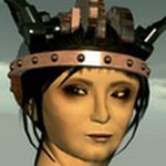
And sure enough, once we reach the upper levels of the structure, the dancing maidens are replaced by plaintive, sad hands reaching out into the sky... Not to mention that on the level just below them we have the sudden appearance of a quizzical "contemporary" full on portrait, one which to me is quite clearly no longer the glorified face of eternal trust and optimism.
Urban Spectre asks a question. An uneasy question to which the artist does not provide an answer. And in the end, for me, this is what the true artistic process should do: Ask uneasy questions to which there are no easy answers, indeed maybe no answers at all.
You can view Urban Spectre, which has also benefited from the input of Desdemona Enfield, Douglas Story and Dizzy Banjo, at the Cetus Institute by teleporting directly from here.
Note: Although, from what I could gather from comments online, there seems to have been a sound installation with this work, sadly, I missed it: I was there for a very long time but heard nothing.
And finally, there is one small criticism that I feel compelled to make, especially given how very deeply I was impressed by the work. The red typography with which the creators of the piece were credited: Not to put too fine a point on it, this is clumsy. I was so taken by Urban Spectre that in this particular case this typographic mishap has not stopped me from thoroughly becoming immersed in the work. Thankfully it stands somewhat out of harms way, at the very top of the building - but it is very much there nonetheless. I am not sure if a considerable number of artists in Second Life® realize how gravely distracting, indeed obstructive, these big and often completely incongruous typographic additions, usually rendered in strong primary colors for enhanced visibility, are to their work? Wouldn't it be much better to put a notecard with the title and credits of the piece in a small, well designed notecard dispenser, placed at the entrance of the installation?
;-)
Saturday, December 27, 2008
the sad intangible who grieve and yearn... Urban Spectre
Posted by
Alpha Auer
at
4:00 AM
![]()
Labels: Cetus Institute, DB Bailey, Desdemona Enfield, Dizzy Banjo, Douglas Story, NPIRL, Second Life®, SL


3 comments:
Hey Alpha,
The sound and music for this installation, which was originally one of the 7 juried art pieces at Burning Life 08, is primarily embedded in the moving platforms.
If you jump between them, landing on different platforms, each plays a different musical tone. Doug and Desdemona would be able to describe the mechanics of this system far better here - but essentially if you land on all the moving platforms it triggers a 'win state' which involves both visual and musical elements.
If you didn't walk on any the platforms you may not have made any sounds, but theoretically there should have been other ambient sounds playing continuously throughout. At least this is how it was set up at Burning Life. However, I'm not sure how complete the re-installation of this piece is at Cetus at present.
The original installation also had a notecard dispenser for instructions and artists information, not sure if that's installed yet.
Bettina? This sort of reminds me of your Data Representation post you did a while back. On that note, I can't find that post. But, you’re on to something with that. In that, the challenge, from a business/web page “virtual” development standpoint. I think, that we are walking on the edge of chaos, and your thing is going to develop into how virtual worlds can express their 'whatever', which will take us to Web 3.0 Its hard to describe, but take what you did and insert it somehow to the "Urban Spectre". Lessen the crowdedness of it via layers and Wha La! This is not to say what you did isn’t nice to look at. But, Urban Spectre gives yours another added perspective, albeit possible way to make it happen. Needs more work..but I think its going to head that way. :) thanks for the post.
Gary hello, I think you may be getting myself and Bett confused, since it is me (Alpha) who made a post on data visualization, with my own work The Bridge Project which somehow made it into a very prestigious datavis portal. Unless, of course, Bett too has made a data representation post in the past that I am not aware of, and you are actually referring to that one - in which case I sincerely apologize.
In any case, the post that I made is right here:
http://npirl.blogspot.com/2008/12/hard-to-believe-but-i-seem-to-have-made.html
In the case of the Bridge Project I did want to confuse and crowd the viewer. Indeed that was the very point of the exercise, since The Bridge was supposed to represent the mental process of free association via the usage of the online thesaurus - thus simulating subconscious associative processes - which are of course extremely convoluted.
I already said back then that the Bridge Project cannot be considered as proper datavis by any definition of the word, since it does not have nearly enough nodes. I do collaborative research in datavis design (this is a completely different area and not in any way connected with my artistic practice, which is where the Bridge rightfully belongs), and in datavis basically any data set with less than a few thousand nodes is not even worthy of consideration as solid research material.
Post a Comment